Data Source: Aurora 30 Minute Forecast
The OVATION Aurora Forecast Model shows the intensity and location of the aurora predicted for the time shown at the top of the map. This probability forecast is based on current solar wind conditions measured at L1, but using a fixed 30-minute delay time between L1 and Earth. A 30-minute delay corresponds to approximately 800 km/s solar wind speed as might be encountered during geomagnetic storming conditions. In reality, delay times vary from less than 30 minutes to an hour or so for average solar wind conditions.
The sunlit side of Earth is indicated by the lighter blue of the ocean and the lighter color of the continents. The day-night line, or terminator, is shown as a region that goes from light to dark. The lighter edge is where the sun is just at the horizon. The darker edge is where the sun is 12 degrees below the horizon. Note that the aurora will not be visible during daylight hours; however, the aurora can often be observed within an hour before sunrise or after sunset.
Data updates every 5 minutes.
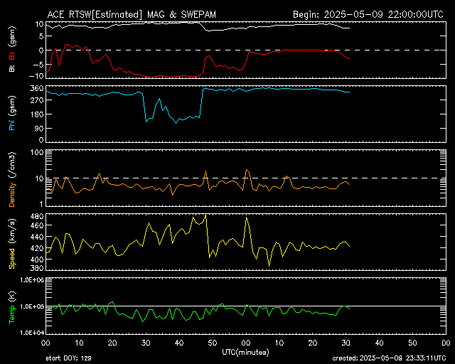
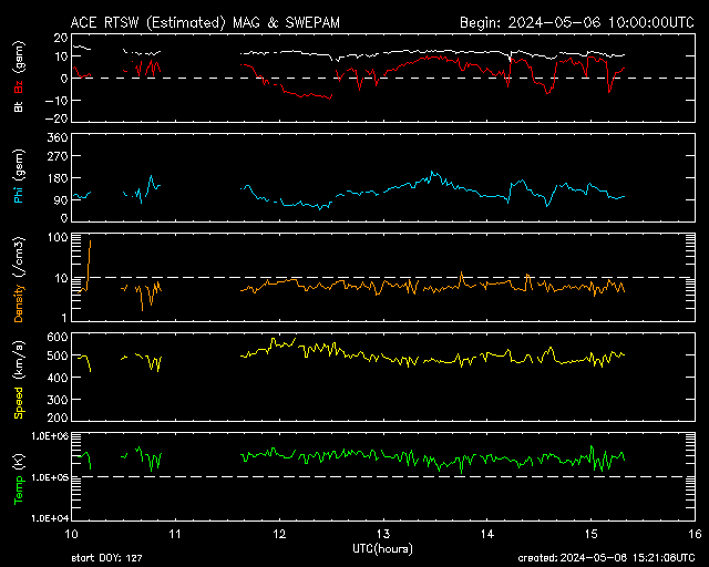
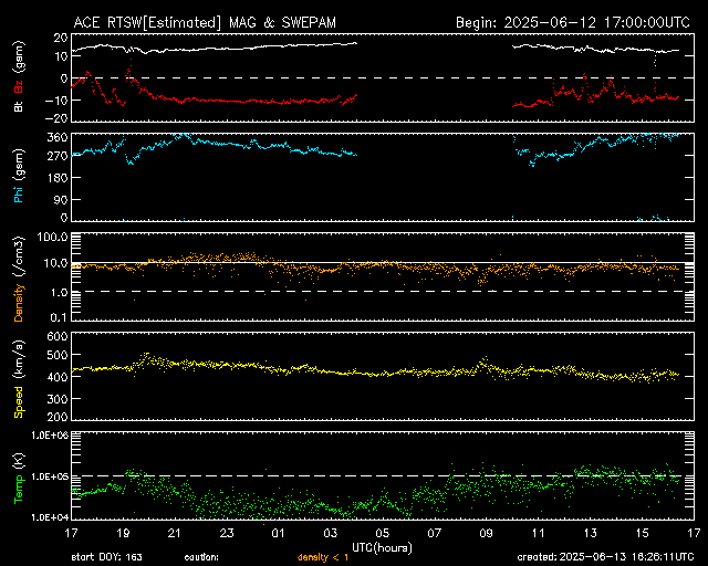
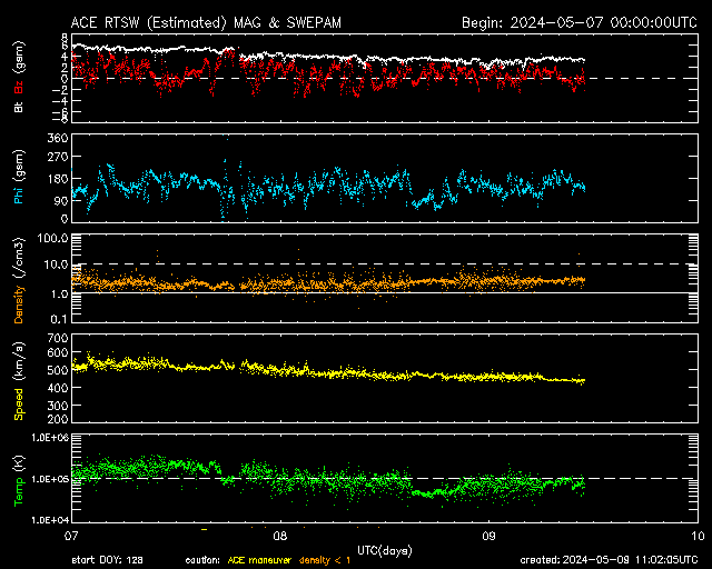
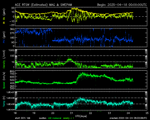
Data Source: ACE Real Time Solar Wind
The data on this graph comes from NASA’s Advanced Composition Explorer (ACE) Satellite. ACE is positioned at the L1 Lagrange Point about 1.5 million km from Earth in the direction of the sun. The satellite samples and measures the solar wind up to 1 hour before it reaches Earth.
Note: Since July of 2016 ACE is no longer the primary source for solar wind data. The new satellite DSCOVR (data shown below) is generally more reliable. The data from ACE frequently blacks out for a number of hours.
There are 5 different measurements shown on this graph:
- Bt/Bz (white/red lines) – Bt indicates the total strength of the Interplanetary Magnetic Field (IMF) carried by the solar wind. A higher number indicates a stronger impact to earth’s magnetic field. Bz indicates the orientation of the IMF. If the Bz is positive (northward), then the earth’s magnetic field will block most of the solar wind, and geomagnetic storming is unlikely. But if Bz is negative (southward), then the sun and the earth’s magnetic field will link up, which allows the solar wind to pour into the earth’s atmosphere, causing the aurora. The further southward the Bz points and the longer the duration, the higher the chance is of a geomagnetic storm occurring.
- Phi (blue line) – Phi is the angle of the IMF measured in the GSM (geocentric solar magnetospheric) coordinate system. Sudden and rapid changes in the Phi angle in conjunction with increased solar wind speeds and Bz fluctuations is common during a CME impact.
- Density (orange line) – The solar wind carries with it plasma (electrons and protons). This is measured in atoms per cubic centimeter. A high and fluctuating plasma density is usually better at stirring up the aurora.
- Speed (yellow line) – Measured in kilometers per second, the speed of the solar wind can vary from 250 – 800+ km/s. A faster solar wind is usually associated with elevated geomagnetic activity.
- Temp (green line) – The temperature of the solar wind is measured in Kelvin units. A rise in temperature is likely during an impact to earth’s magnetic field.
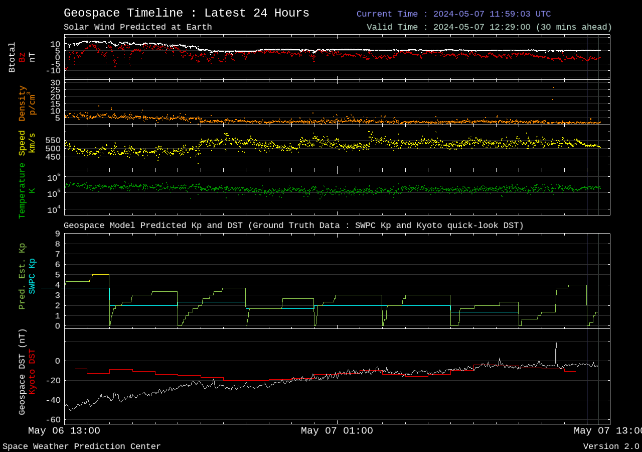
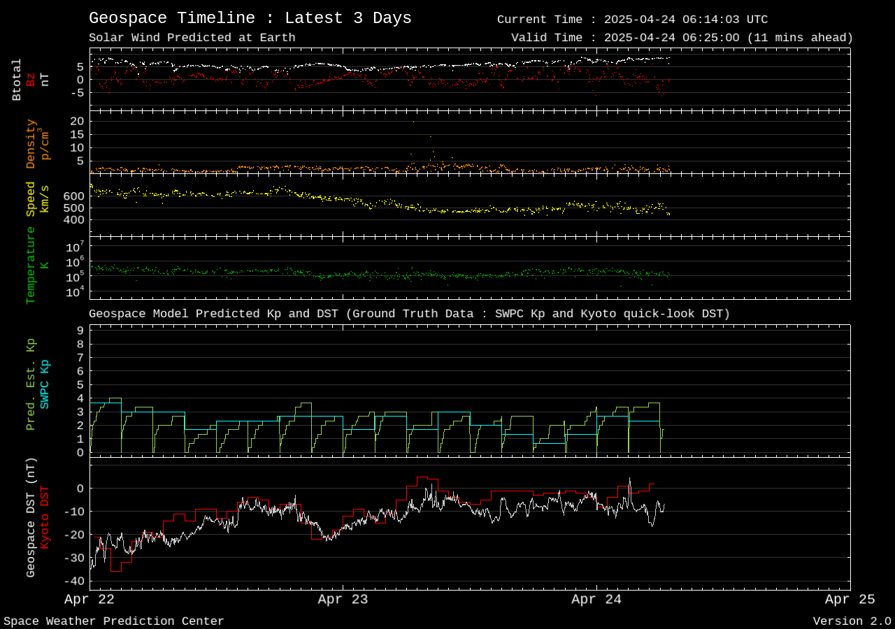
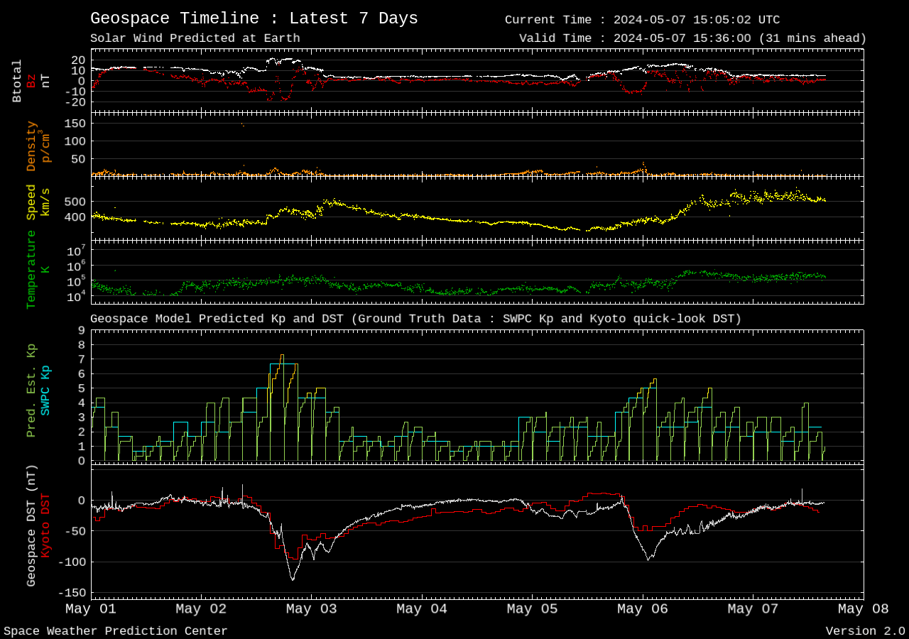
Data Sources: DSCOVR Real Time Solar Wind // Geospace Plot
The real time solar wind data on this graph comes from NASA’s Deep Space Climate Observatory (DSCOVR) Satellite. DSCOVR is positioned at the L1 Lagrange Point about 1.5 million km from Earth in the direction of the sun. The satellite samples and measures the solar wind 15 to 60 minutes before it reaches Earth, and the SWPC uses this data to issue warnings.
Note: Since July of 2016, DSCOVR is the primary source of solar wind data. The data is generally more reliable than that from the ACE satellite, which is now used as a backup.
There are 4 different measurements shown at the top of this graph:
- Bt/Bz (white/red lines) – Bt indicates the total strength of the Interplanetary Magnetic Field (IMF) carried by the solar wind. A higher number indicates a stronger impact to earth’s magnetic field. Bz indicates the orientation of the IMF. If the Bz is positive (northward), then the earth’s magnetic field will block most of the solar wind, and geomagnetic storming is unlikely. But if Bz is negative (southward), then the sun and the earth’s magnetic field will link up, which allows the solar wind to pour into the earth’s atmosphere, causing the aurora. The further southward the Bz points and the longer the duration, the higher the chance is of a geomagnetic storm occurring.
- Density (orange line) – The solar wind carries with it plasma (electrons and protons). This is measured in atoms per cubic centimeter. A high and fluctuating plasma density is usually better at stirring up the aurora.
- Speed (yellow line) – Measured in kilometers per second, the speed of the solar wind can vary from 250 – 800+ km/s. A faster solar wind is usually associated with elevated geomagnetic activity.
- Temp (green line) – The temperature of the solar wind is measured in Kelvin units. A rise in temperature is likely during an impact to earth’s magnetic field.
The bottom half of the graph shows a short-term KP value prediction as well as the DST value. DST (Disturbance Storm Time index) is a measure in nanoTeslas of the ring current around earth and the strength of the magnetic field. Sharply negative values are associated with geomagnetic storms.
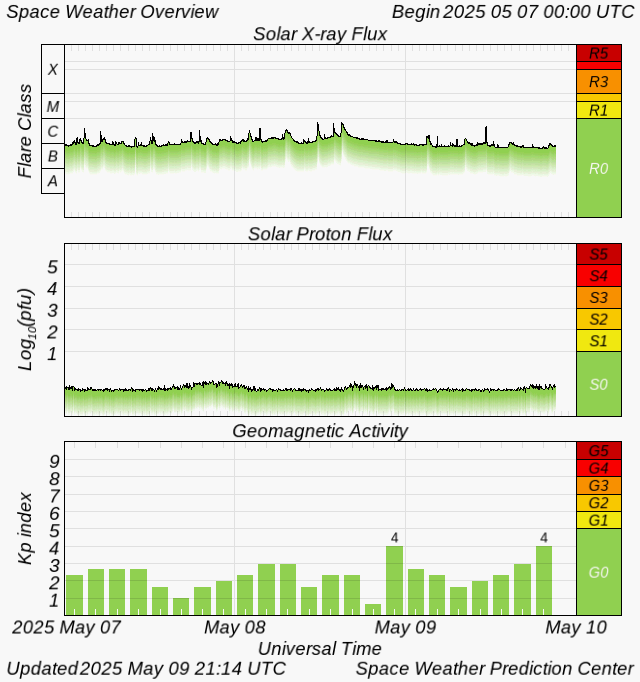
Data Sources: Space Weather Overview // Station K Indeces
Learn more about the KP index on this page: KP Index explained
The KP Index chart is of limited use because it only updates every 3 hours. Activity may vary during those 3 hours and a geomagnetic storm may be completely over by the time it refreshes. The first tab shows the KP index over a 3-day period.
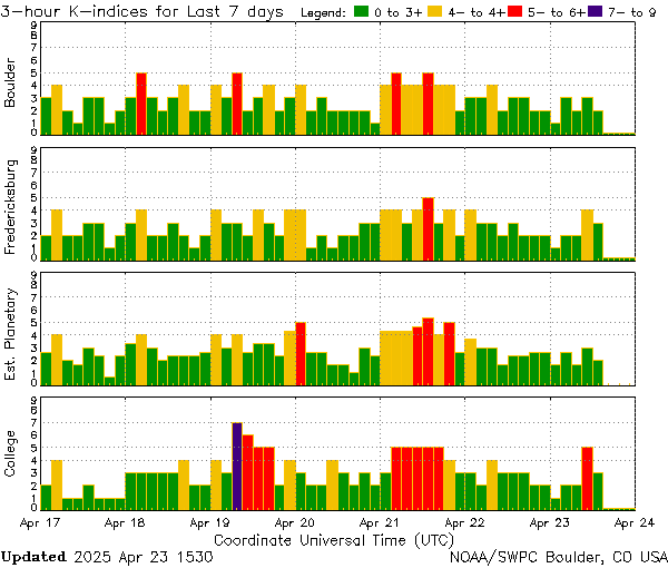
7 Day
This chart shows local K-indices as well as the estimated planetary KP Index. The stations shown are Boulder, Colorado and Fredericksburg, Virginia, and Fairbanks, Alaska (College). Unless you happen to be near one of these observatories, it’s best to look at the Estimated Planetary KP Index, which is the 3rd row down.

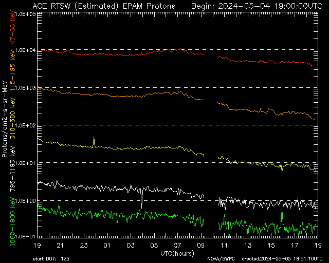
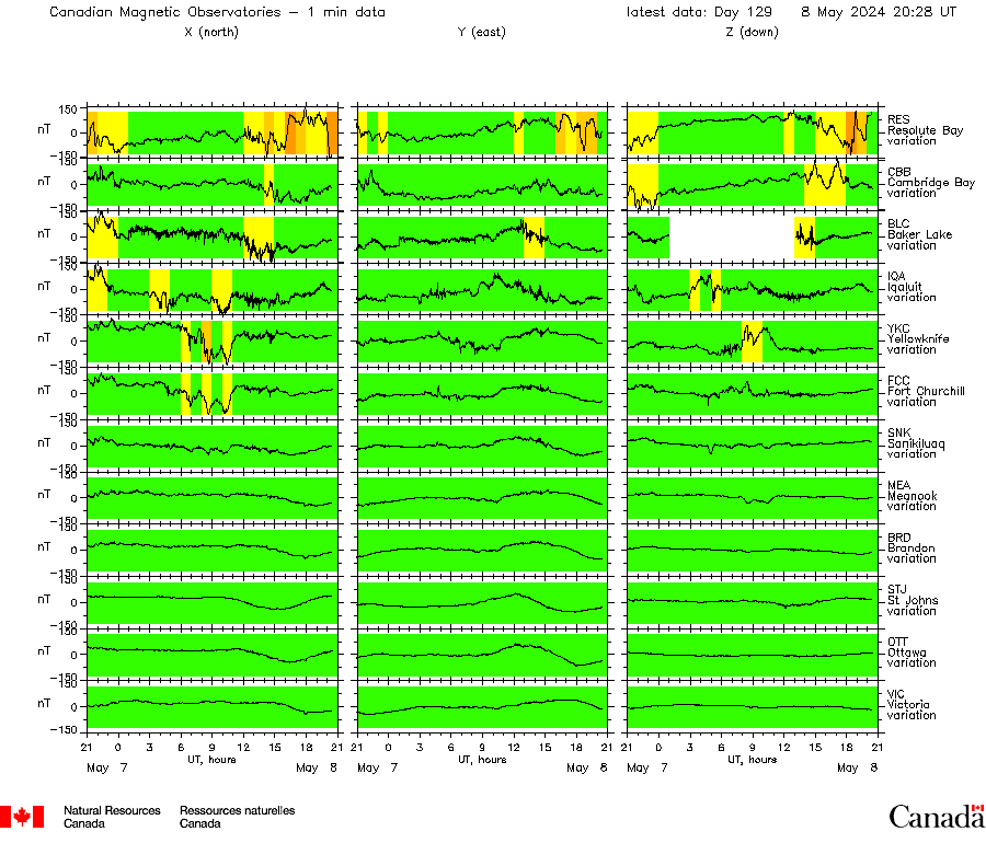
Data Sources: AE Index // ACE EPAM// Canadian Magnetic Observatories
AE Index
ACE EPAM
Canadian Magnetic Observatories
Next 3 Days:
Next 27 Days:
Data Sources: Notifications Timeline // 3-Day Geomagnetic Forecast // 27-Day Outlook // Forecast Discussion
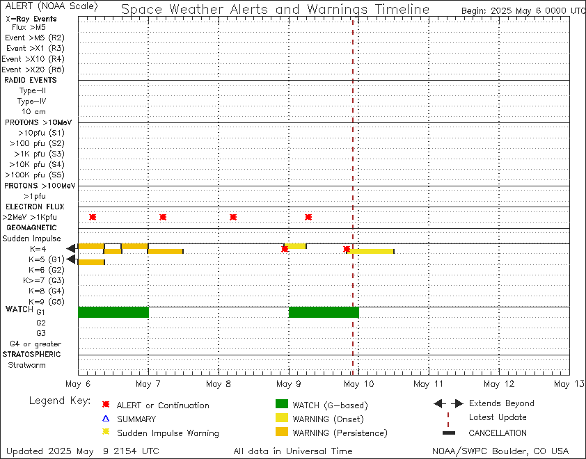
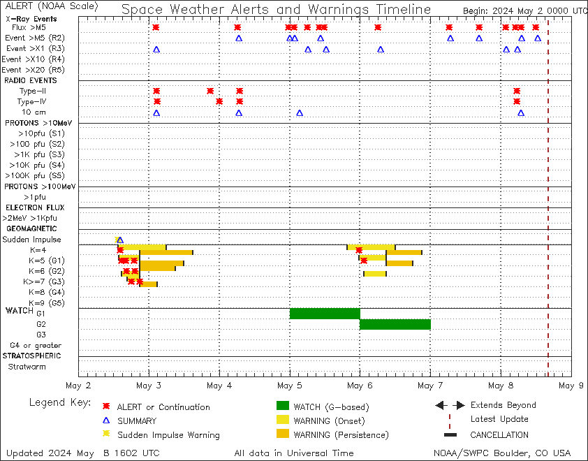
The timeline provides a quick look at the alerts, watches, and warnings that are currently in effect from NOAA. Only the bottom half of the chart is important when it comes to seeing the aurora. The dashed red vertical line represents the current time.
A solid green bar represents a watch, when NOAA is predicting a geomagnetic storm to occur. A watch is issued for 24 hours at a time, because the exact timing can be very uncertain. Watches don’t always verify, but they can still provide a heads up.
A solid yellow or orange bar represents a warning, after a threshold of Kp4 or above has been reached. A warning will be issued for several hours at a time, but the geomagnetic storm may not last for the entire duration.
You can sign up to receive these alerts, watches, warnings, and forecasts in your email here: NOAA Subscription Services